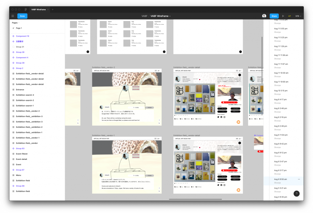
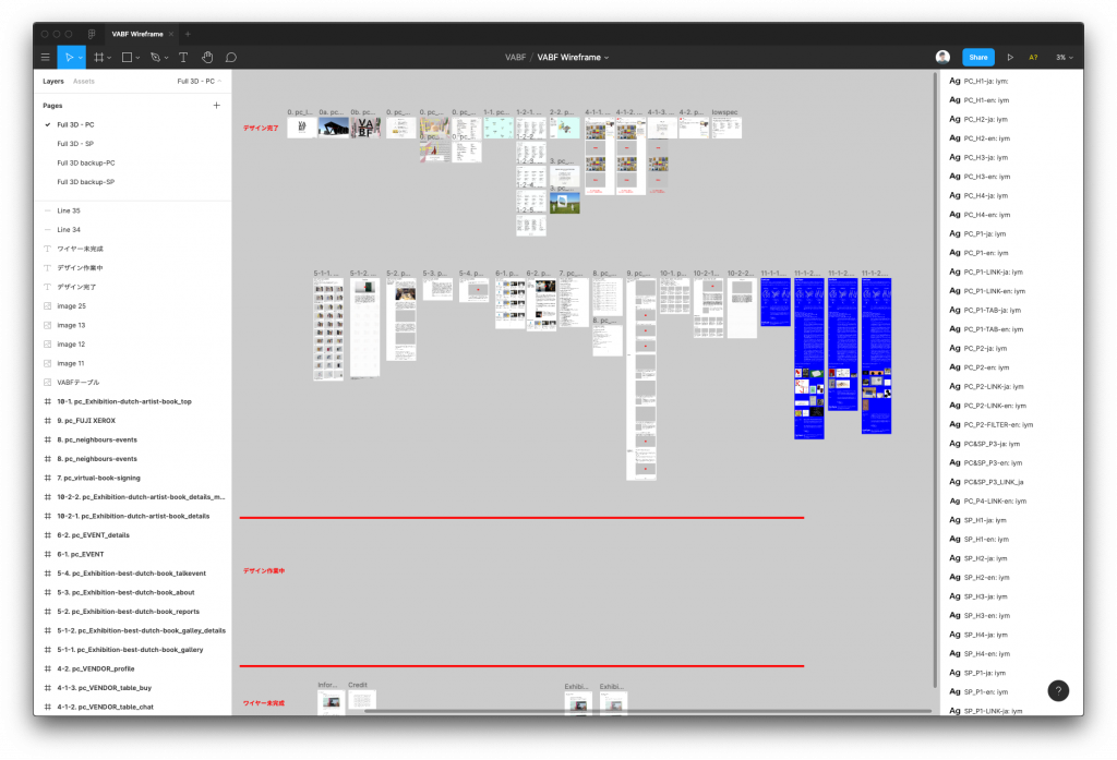
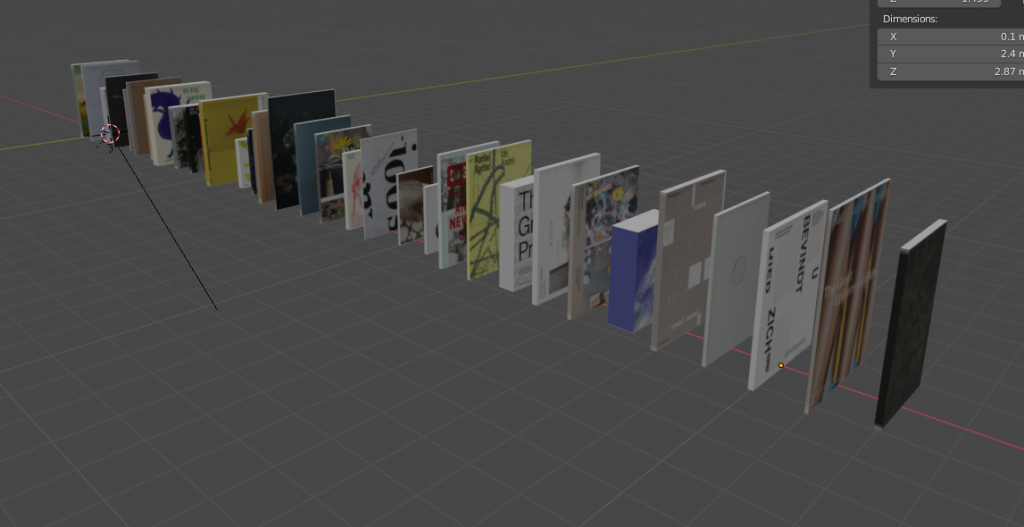
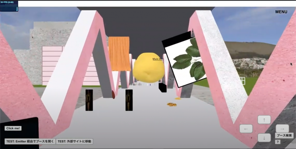
The “TOKYO ART BOOK FAIR” (TABF), which was scheduled to be held this fall, is now online as the “VIRTUAL ART BOOK FAIR” (VABF), with a 3D space designed in the motif of the Museum of Contemporary Art Tokyo that features approximately 230 artists and publishers, as well as an exhibition of art books gathered by the gallery. I asked web director Shunya Hagiwara about the behind-the-scenes design of this exhibition.
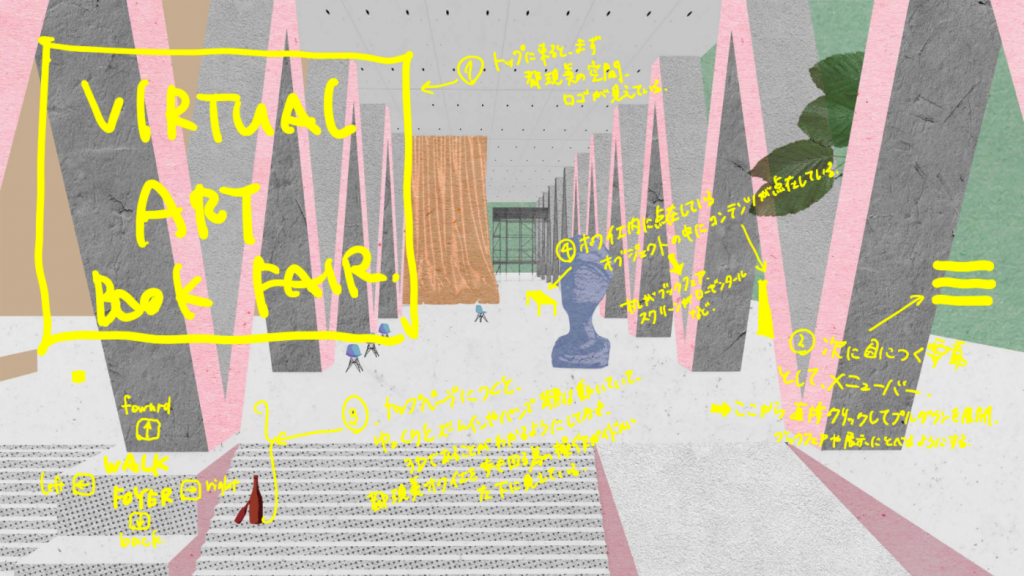
The VABF is inspired by the Museum of Modern Art and visitors can walk around in a 3D space and click on objects to view the content.
There are various virtual measures these days, but unless you have VR goggles and a 5G connection, and the resolution and communication speed are on the same level as in real life, you’ll find it a lackluster or lonely alternative to the real world. We had a lot of discussions with the management, architecture, graphics, and web teams, starting with the idea that it would be better to extract the essence of TABF and deform it.
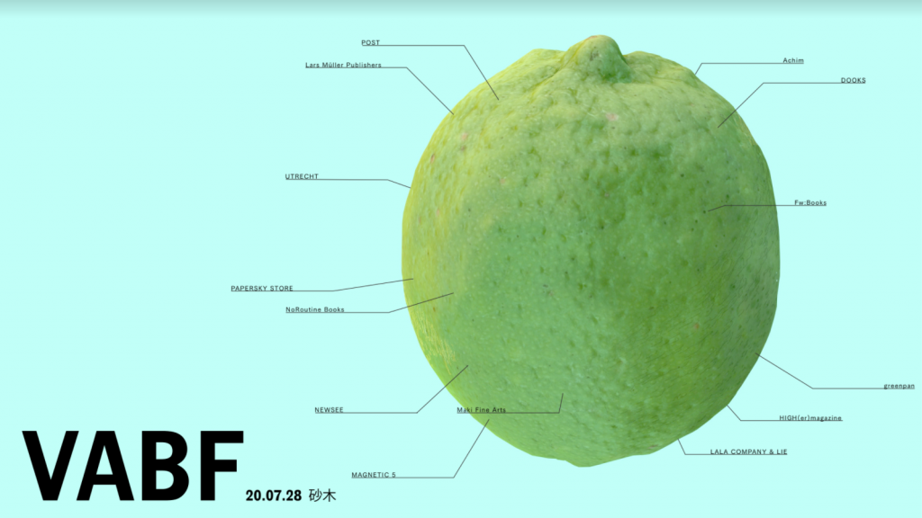
This time, there was a huge potato suspended at the entrance to the venue, and when you enter it, there were booths. It was interesting to see how the discussion progressed from the point of view of “how people interact with 3D objects,” rather than focusing on the creation of a “building.” In a 3D space where anything is possible, we had to ask questions such as “Is gravity even necessary in the first place?” “Should it be a potato or a mushroom?” However, if I just listed everything like products, it would be indistinguishable from normal e-commerce, so I left in some elements that would make it properly recognizable as a “book fair.”
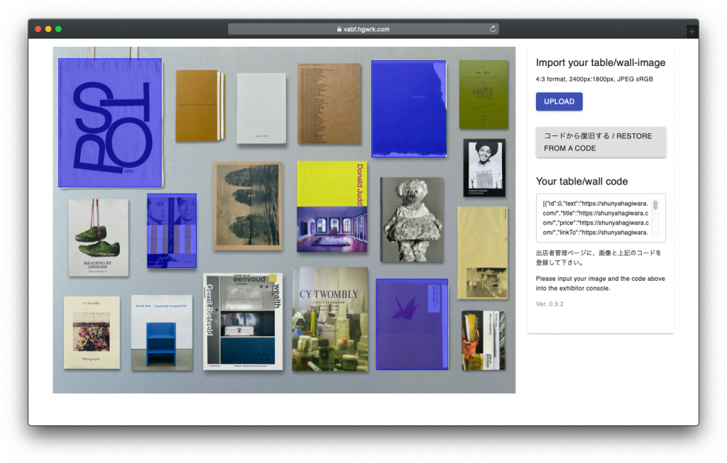
According to the management team, it was important for TABF to have a unique layout on the tables of the exhibitors. Therefore, we set a pixel limit on the size of JPEGs that can be placed in the booths, so exhibitors can arrange their works and create images as they wish. We also wanted to encourage visitors to actively find products that they are interested in, so we developed an application that allows them to tag the images, just like Instagram. By linking/tagging information to specific parts of the image, you can read more about the work with a click.
Does defined user experience and structure of UI design not somewhat run counter to the coincidence and unexpected encounters that are the best parts of real world experiences?
It’s difficult to recreate the real-life experience of stopping off on the road or meeting a friend at the venue in a virtual space. Although there is a direct line of communication between exhibitors and customers, and video chat… as a programmer, I tend to want the users to behave in the way we expect them to behave, and that’s why I’m trying to avoid a “planned harmony” for this project. That’s why the theme for this year’s event was “avoiding a schedule-concordance as much as possible,” and one way to do that is to leave plenty of room for exhibitors to hack into the JPEGs and do whatever they want on them.
As platforms like social media mature, the rules of what you can and can’t do become clearer, and there are restrictions on users’ behavior. This time, we took advantage of the lack of time before the event, and it was rather straight-forward, and the idea was that everyone, including the management team, should work together to devise a way to work within this system.
It’s a willingness to delegate the user’s code of conduct with as little control as possible.
Yes, the “Internet Market” started by IDPW is a platform with a loose theme where participants can freely buy and sell Internet-like items, and the interpretation of that “Internet-like” is left up to each individual. Some of the exhibitors at the Yami-ichi go beyond the limitations of the market, but by understanding their interpretations, it is possible to ask “Is this Internet-like?” And it also makes me rethink the nature of the Internet. In this VABF, I believe that there are people who will go beyond our intentions, and I personally think that “people who go beyond” are the most interesting people. It’s a tricky and most exciting moment for me to see someone go beyond what we have designed.
Lawrence Lessig, the information scientist who coined the concept of Creative Commons, says in his book CODE, “Code is the law in the world of the Internet and computing.” Programming code can dominate what users can and cannot do, and as such it is like the law. In this cushy world, if I was going to work with code, I wanted to do it with a spontaneous worldview. Especially at these events, I’m very conscious of how far I can leave it up to the users, and whether a piece of code will add to the restrictions.
Especially in the last few years, the cracks seem to be noticeable on the Internet (≒ Social Media).
I completely agree with you in that sense, but I guess in a way it could be called “mature.” As a continuation of the code story, for example, the first floor of a 100-story building is a public space, and people gather there to play. When you get on the elevator, you can’t press any buttons except the first floor and the 100th floor. But from the outside, you can see that all the floors have lights on and someone is working hard ……. Wouldn’t it be insanely creepy if there was a building like that? Today’s social networking sites are just like that. I want to be a modest web designer who is a little more pure, who stays close to the people who want to express themselves and create with them.
What do you recommend as a designer to enjoy VABF?
It would be nice if the people who experience it could optimize it for a virtual setting and have fun with it. For example, how about having a Zoom drinking session on VABF? Gather distant or overseas friends you wouldn’t normally meet, and use the screen sharing function to go around the venue together. I think it would be a good snack.
